We aimed to bring Rule’s vision of authentic social interaction to life by focusing on seamless design and user privacy.
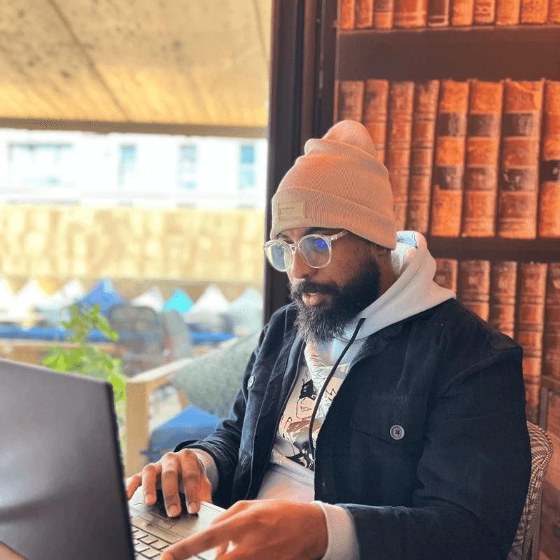
Mohamed Elghazoui
Member of the team
We aimed to bring Rule’s vision of authentic social interaction to life by focusing on seamless design and user privacy.
Mohamed Elghazoui
Member of the team
Rule is an innovative SaaS company that’s been making waves with its marketing automation tools. But as they grew, their digital presence—both the web app and the website—started to feel outdated. It wasn’t just about aesthetics; they needed a consistent design system that could scale with them and improve the user experience across the board. That’s where we came in. Rule needed more than just a few tweaks—they were looking for a partner who could dive in, understand their brand, and help them elevate everything from the ground up. We knew this wasn’t going to be a quick fix; it was about building something that would last and grow with them.
Rule is an innovative SaaS company that’s been making waves with its marketing automation tools. But as they grew, their digital presence—both the web app and the website—started to feel outdated. It wasn’t just about aesthetics; they needed a consistent design system that could scale with them and improve the user experience across the board. That’s where we came in. Rule needed more than just a few tweaks—they were looking for a partner who could dive in, understand their brand, and help them elevate everything from the ground up. We knew this wasn’t going to be a quick fix; it was about building something that would last and grow with them.

Our journey together: from design chaos to cohesion
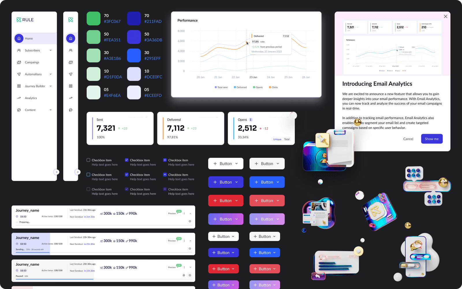
1. Building a unified design system We started by creating a design system that would serve as the backbone for all of Rule’s digital products. Think of it as a playbook that keeps everyone—designers, developers, and even marketers—on the same page.
Component libraries: We developed a set of reusable components. These are like building blocks that can be used across different parts of the app and website, ensuring everything looks and feels consistent. Detailed guidelines: We didn’t stop at just making components. We documented everything—color schemes, typography, spacing rules—so that anyone on Rule’s team could pick it up and run with it. This wasn’t just about making things look pretty; it was about creating a system that could evolve as Rule did.
Our journey together: from design chaos to cohesion
1. Building a unified design system We started by creating a design system that would serve as the backbone for all of Rule’s digital products. Think of it as a playbook that keeps everyone—designers, developers, and even marketers—on the same page.
Component libraries: We developed a set of reusable components. These are like building blocks that can be used across different parts of the app and website, ensuring everything looks and feels consistent. Detailed guidelines: We didn’t stop at just making components. We documented everything—color schemes, typography, spacing rules—so that anyone on Rule’s team could pick it up and run with it. This wasn’t just about making things look pretty; it was about creating a system that could evolve as Rule did.


2. Redesigning the web application
The web app is at the heart of Rule’s offering. It’s where their customers spend the most time, so it needed to be functional but delightful to use. Understanding users: We kicked things off with some deep user research. We talked to Rule’s users, dug into analytics, and identified where they were getting stuck or frustrated. One key insight? The onboarding process needed simplification. Fresh, modern UI: With these insights in hand, we redesigned the interface. The new look is clean, modern, and intuitive. Navigation is smoother, and users can now get things done faster, without the hassle. Testing with prototypes: Before anything went live, we tested our designs with real users through interactive prototypes. This allowed us to fine-tune things based on feedback and ensure we were hitting the mark.
Revamping the website Next up was the website. This is Rule’s digital front door, and it needed to make a great first impression. Consistency is key: We brought the website in line with the new design system. Now, whether users are on the web app or browsing the site, they’re getting the same cohesive experience. Mobile-first design: With so many users accessing the site from their phones, we made sure the design was fully responsive. It looks great and works smoothly, no matter what device you’re on. Engagement-driven: We focused on making the website a place that draws users in and gets them excited about what Rule has to offer. Clear calls-to-action and engaging visuals were key here.